Styling guide
What you wear should do two things at once: feel like you,
and look good in the place we’re shooting.
The goal isn’t to “match” each other. The goal is
to belong together.
A few simple rules that always work:
- Don’t dress everyone in the same thing. Similar vibes are great, identical outfits aren’t.
- Neutrals are your best base. Pick calm tones and build around them.
- If you want a stronger colour, use it on one person or as one piece, not on everyone.
- Skip neon and anything that glows in the dark. Bright is fine. Fluorescent isn’t.
- Try to avoid big logos, text or loud branding. It pulls focus away from you.
- Be careful with patterns. One patterned piece can look amazing. Several patterned outfits can look overwhelming.

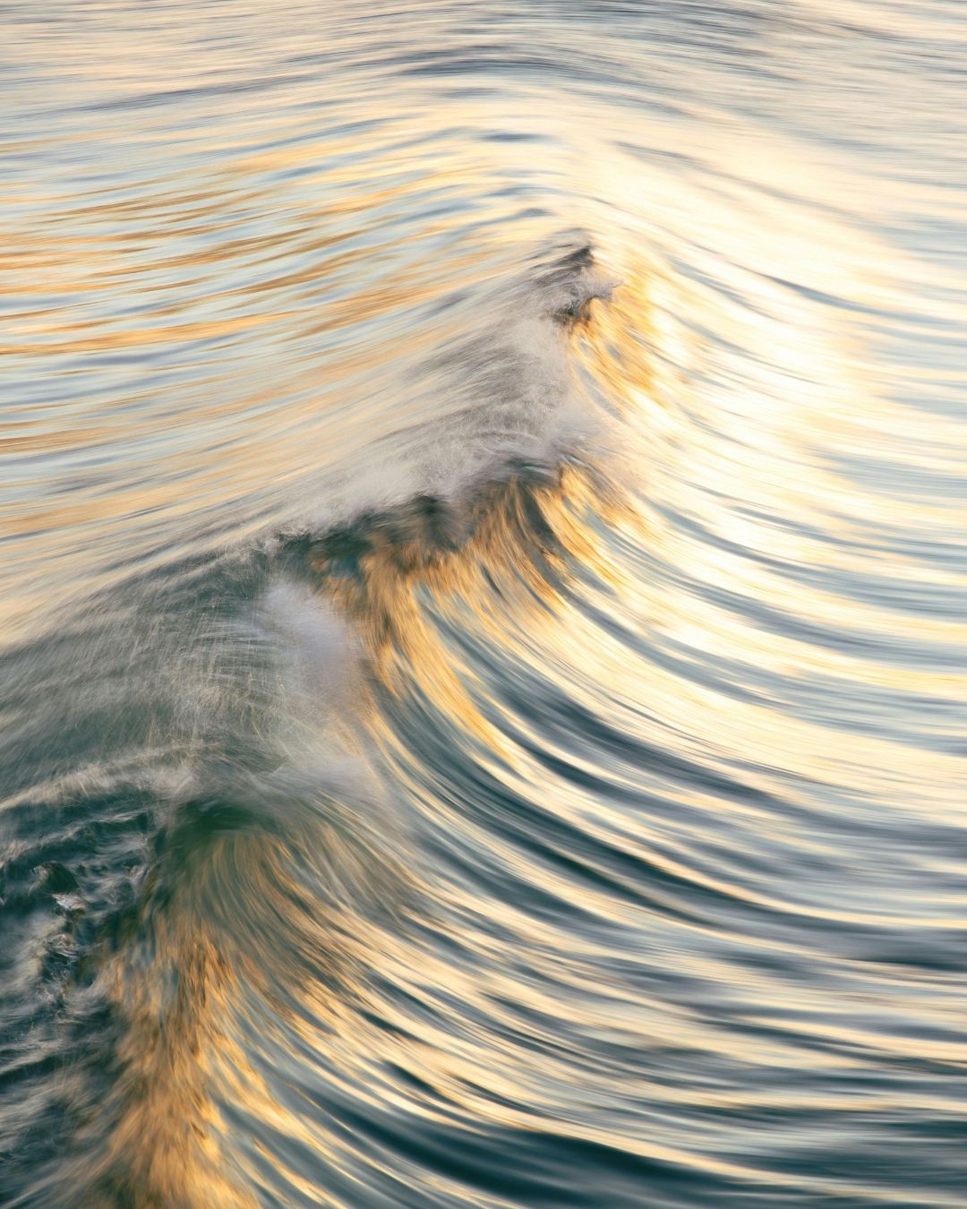
Beach / water
soft, light tones work beautifully
(white, cream, sand, pale blue)
Parks / fields
warm colours bring life against all the green
(rust, mustard, terracotta)
+
paired with neutrals
City / architecture
deeper tones and clean shapes look great
(black, denim, camel, dark red)
+
with one softer element
you don’t need to buy anything new unless you want to.
we’ll work with what you already have.